The way they talk about it makes it sound like they invented the written word, but that notwithstanding the fonts actually look really nice in my opinion.
Very interesting technique to get the widths of the glyphs uniform without them looking ugly in most cases. OK, one can make it look bad if you know the “pain points” of the system, but in normal flowing texts, the fonts do look good.
Some people care more about having fancy tools than actually doing work with them.
On reddit, I used to subscribe to the VS Code subreddit. A lot of posts were just about themes, people asking “what theme is this” or posting their latest minor recolor. Meanwhile, I’m there for posts about actually using the damn thing.
I mean, they look nice, but I don’t dislike whatever the default font that I use is, and I’m definitely not going to go out of my way to change a font. As long as it’s legible, I don’t really give two shits what the font is.
It’s a cool idea and the example they gave actually seemed pretty neat.
I’d (somewhat perversely) love to see this feature tried in a terminal emulator.
ANSI does actually define escape codes for switching to alternative fonts (ESC [ 10 m through ESC [ 19 m) though I don’t know of any software or even term drawing library that uses it.
Kitty terminal has a lot of configurations for fonts. I beleive you can get down to adjustments for specific charecters. Idk if it uses the specific technology you are suggesting. But it is explained in the kitty.conf docs.
I can’t shake this feeling that these are lacking something, like I remember looking at Fira for the first time and being like wow, even jetbrains mono had a sort of generic charm. These on the other hand, are just meh.
Maybe they are someone’s cup of tea though. I am sure in 6 months I will be hearing about how GitHub invented the developer font of some rubbish like that.
Oh man fonts for coding are such a huge thing. There are people making their own forks of so they have certain glyphs, or a line through the zero (or vice versa) or little changes to other specific chars.
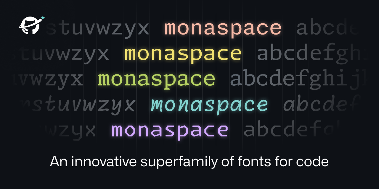
What makes this unique is that they’re saying this allows for different fonts in the same piece of code. So you could have comments in one font, your code in another, AI written code in another, etc. Looks like all the fonts are the same size, so everything still aligns nicely.
You can check out fonts here and filter based on mono spacing, ligatures, etc. Hack is by far my favorite font but I just wish I could use it with nerdfont/jetbrains ligatures. It just has this beautiful way of being able to look open and readable while taking up less space than fonts like fira or jetbrains.
Cool for them for making a font, but personally don’t think it’s up to firacode, hack, jetbrains or many other fonts out there
Wait, why did they invent the phrase “texture healing” for literally what all mono space fonts try to do: make a monospace font that doesn’t look like cluttered shit.
oh wait you’re right. I wasn’t having luck with the nerd fonts on windows but on linux it was somewhat better. what I was thinking about was having Hack with nerd fonts and Jetbrains ligatures patched in. I found a couple repos that purported to do that except the ligatures never worked.
Wait, why did they invent the phrase “texture healing” for literally what all mono space fonts try to do: make a monospace font that doesn’t look like cluttered shit.
They explain it as the same way cursive fonts can have variations on the letters so that they match up (the loop of the y into the e for example). I think it works by having various versions of each glyph: normal, wider to the left, wider to the right, etc) and then pick the glyph based on the surrounding ones.
Because otherwise they couldn’t justify their continued work on things nobody asked for.
Also, those letter combinations are called ligatures, and are generally a bad idea in monospace fonts. The point of them is to make it very clear where one character ends and the next one begins.
Turns out I viscerally despise “handwriting” fonts. They’re harder to read. It just makes me recoil.
I also intensely dislike "ligatures " that turn like == into a separate glyph. Or the one that turns >= into the > with the line under it. No. Stop. That’s not what I typed. That’s not what I’m looking for when I scan the text.
Side note: I assume someone is feeling clever and is thinking of replying with a handwriting font message with ligatures. You don’t have to. I already imagined it.
The texture healing seems cool though, but I didn’t immediately notice or understand until I read through the detailed section on it.
I personally like ligatures when I’m programming. It took me some getting used to, but now I can’t live without them due to how distinct it makes the code segments. I fully understand disliking them though. Thankfully fonts like source code pro allow disabling features like ligatures and their godawful handwriting styled italics, so you’re able to use just the parts you like.
You are not logged in. However you can subscribe from another Fediverse account, for example Lemmy or Mastodon. To do this, paste the following into the search field of your instance: [email protected]
This is the official technology community of Lemmy.ml for all news related to creation and use of technology, and to facilitate civil, meaningful discussion around it.
Ask in DM before posting product reviews or ads. All such posts otherwise are subject to removal.
Rules:
1: All Lemmy rules apply
2: Do not post low effort posts
3: NEVER post naziped*gore stuff
4: Always post article URLs or their archived version URLs as sources, NOT screenshots. Help the blind users.
5: personal rants of Big Tech CEOs like Elon Musk are unwelcome (does not include posts about their companies affecting wide range of people)
6: no advertisement posts unless verified as legitimate and non-exploitative/non-consumerist
7: crypto related posts, unless essential, are disallowed


Very interesting technique to get the widths of the glyphs uniform without them looking ugly in most cases. OK, one can make it look bad if you know the “pain points” of the system, but in normal flowing texts, the fonts do look good.
Too bad I’m married to JetBrains Mono.
Does anyone know if Jetbrains Mono also does the whole dynamic width thing?
Could elaborate on what the “dynamic width thing” means?
The text healing that is mentioned in the link
Letters like m and I are still same pixel width, you just use function of openfonts to shift letters and replace with wider version where possible.
#[ i ][ w ]
Becomes
#[ i ][\/\/]
Like how Neo flexes in the hallway and the entire Matrix flexes around him, except with wide letters like ‘m’.
Don’t think it does.
I broke up with JB Mono a while ago :'(
deleted by creator
I’d never bother changing whatever default font the editor comes with and I don’t understand why anyone would care to
Some people care more about having fancy tools than actually doing work with them.
On reddit, I used to subscribe to the VS Code subreddit. A lot of posts were just about themes, people asking “what theme is this” or posting their latest minor recolor. Meanwhile, I’m there for posts about actually using the damn thing.
deleted by creator
I mean, they look nice, but I don’t dislike whatever the default font that I use is, and I’m definitely not going to go out of my way to change a font. As long as it’s legible, I don’t really give two shits what the font is.
This is pretty cool. But I’ll stick with Anonymous pro.
Iosevka for life, baby.
Great, now whenever I want to talk to someone about Mona Font, they’re going to get confused.
Having different font styles depending on the context is a really nice feature. I’ll definitely give it a try.
A lot of code editors support that without the weird “healing” features they laid out here.
VSCode has pretty decent semantic based formatting options.
It’s a cool idea and the example they gave actually seemed pretty neat.
I’d (somewhat perversely) love to see this feature tried in a terminal emulator. ANSI does actually define escape codes for switching to alternative fonts (ESC [ 10 m through ESC [ 19 m) though I don’t know of any software or even term drawing library that uses it.
Kitty terminal has a lot of configurations for fonts. I beleive you can get down to adjustments for specific charecters. Idk if it uses the specific technology you are suggesting. But it is explained in the kitty.conf docs.
That would really be neat.
I can’t shake this feeling that these are lacking something, like I remember looking at Fira for the first time and being like wow, even jetbrains mono had a sort of generic charm. These on the other hand, are just meh.
Maybe they are someone’s cup of tea though. I am sure in 6 months I will be hearing about how GitHub invented the developer font of some rubbish like that.
No support for this yet in VSCode it seems.
Ironic. It’s as if Microsoft departments aren’t even aware of each other.
Fonts are an OS thing. If you don’t have support for it, that’s because you haven’t downloaded it yet.
I was talking about this…
https://github.com/githubnext/monaspace/issues/6
I want to make a joke about how terrible the name is with just throwing in an ‘a’, but I don’t think it would be right since I’m using Fira Code.
People actually change fonts in their IDE? I’ve always used whatever the default is and never even thought about it.
some people even change default system fonts used in the deskop environment (menu’s, filemanager etc) 😎😁
Damn, I need to get out more.
Actually you have to stay in more to get into this sort of thing.
I’m an Envy Code R fan myself.
deleted by creator
I was also like that until I discovered ligatures were thing.
Oh man fonts for coding are such a huge thing. There are people making their own forks of so they have certain glyphs, or a line through the zero (or vice versa) or little changes to other specific chars.
What makes this unique is that they’re saying this allows for different fonts in the same piece of code. So you could have comments in one font, your code in another, AI written code in another, etc. Looks like all the fonts are the same size, so everything still aligns nicely.
I always do. I’m a fan of JetBrains Mono.
It is the default font. At least in all the JetBrains IDE
Try Fira Code font
I’m a big fan of Fira Code! I haven’t found any others I like more.
I actually have. I didn’t install it in an IDE, though. This font comes with popOS
Love Fira Code but recently switched to https://typeof.net/Iosevka/ and it’s equally great.
You just made my day. Thank you.
I’ve always preferred IBM’s Plex Mono, specifically the Nerd Fonts version.
https://www.programmingfonts.org/#hack
You can check out fonts here and filter based on mono spacing, ligatures, etc. Hack is by far my favorite font but I just wish I could use it with nerdfont/jetbrains ligatures. It just has this beautiful way of being able to look open and readable while taking up less space than fonts like fira or jetbrains.
Cool for them for making a font, but personally don’t think it’s up to firacode, hack, jetbrains or many other fonts out there
Wait, why did they invent the phrase “texture healing” for literally what all mono space fonts try to do: make a monospace font that doesn’t look like cluttered shit.
Not sure if you misspoke or are just unaware of it, but Hack is one of the prepatched nerd fonts: https://github.com/ryanoasis/nerd-fonts/tree/master/patched-fonts/Hack. Also, for any fonts that aren’t prepatched, there’s a patcher in that repo to make any font a nerd font.
oh wait you’re right. I wasn’t having luck with the nerd fonts on windows but on linux it was somewhat better. what I was thinking about was having Hack with nerd fonts and Jetbrains ligatures patched in. I found a couple repos that purported to do that except the ligatures never worked.
They explain it as the same way cursive fonts can have variations on the letters so that they match up (the loop of the y into the e for example). I think it works by having various versions of each glyph: normal, wider to the left, wider to the right, etc) and then pick the glyph based on the surrounding ones.
Pretty cool actually, though I highly doubt this is an innovation. Good for them if they’re actually the first font to do this
Because otherwise they couldn’t justify their continued work on things nobody asked for.
Also, those letter combinations are called ligatures, and are generally a bad idea in monospace fonts. The point of them is to make it very clear where one character ends and the next one begins.
This is the one I use.
Such a subjective thing and often heavily based on familiarity, but looking at that solidifies my appreciation for Ubuntu Mono
That’s a nice one!
Seems neat, I do love Sauce Code Pro though.
I didn’t think I had strong opinions on fonts.
Turns out I viscerally despise “handwriting” fonts. They’re harder to read. It just makes me recoil.
I also intensely dislike "ligatures " that turn like
==into a separate glyph. Or the one that turns>=into the > with the line under it. No. Stop. That’s not what I typed. That’s not what I’m looking for when I scan the text.Side note: I assume someone is feeling clever and is thinking of replying with a handwriting font message with ligatures. You don’t have to. I already imagined it.
The texture healing seems cool though, but I didn’t immediately notice or understand until I read through the detailed section on it.
I personally like ligatures when I’m programming. It took me some getting used to, but now I can’t live without them due to how distinct it makes the code segments. I fully understand disliking them though. Thankfully fonts like source code pro allow disabling features like ligatures and their godawful handwriting styled italics, so you’re able to use just the parts you like.